EUROSTILE

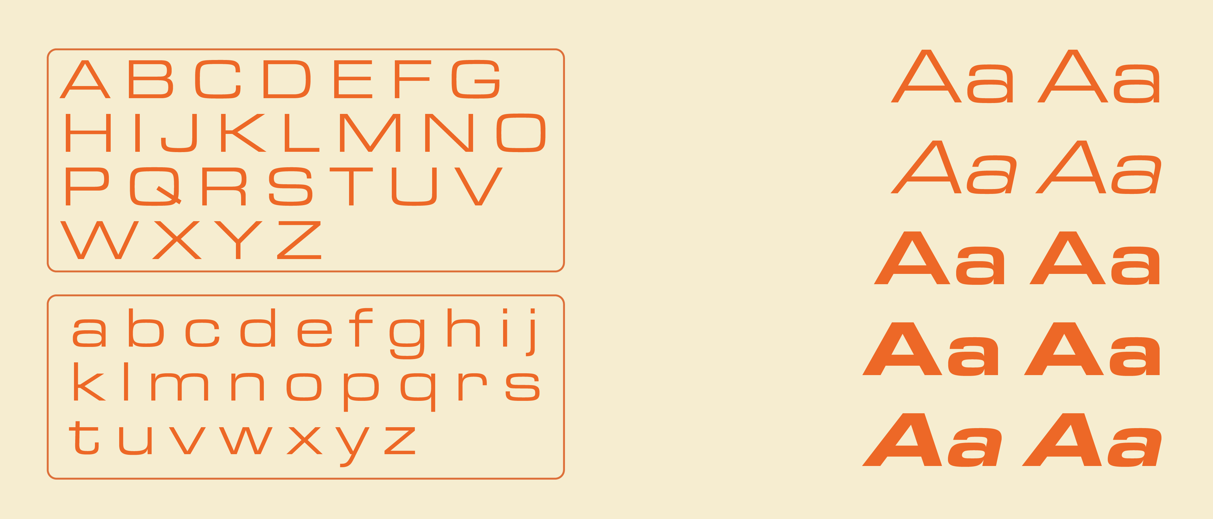
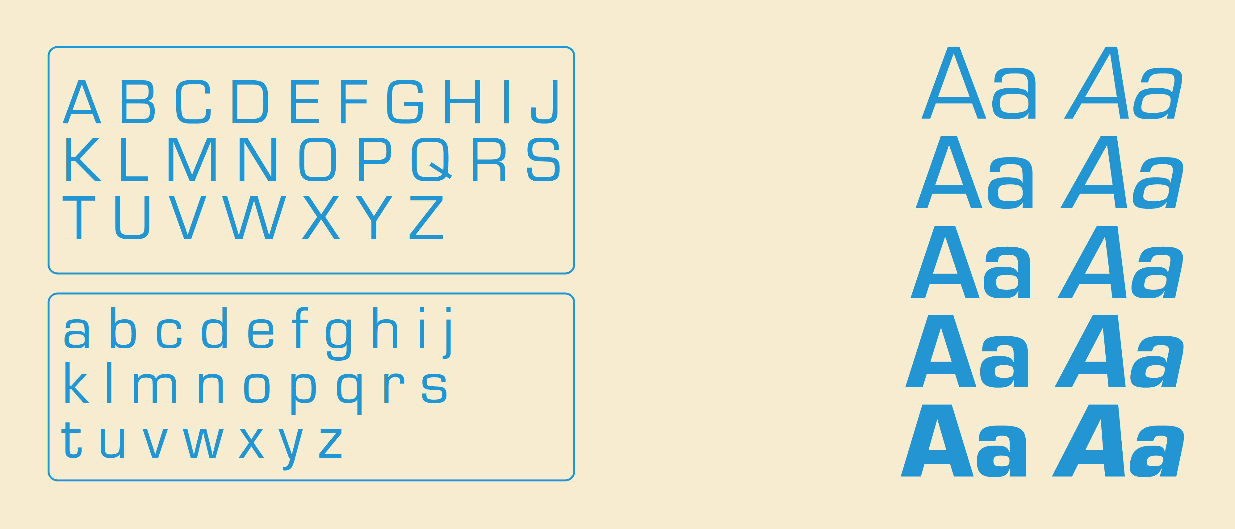
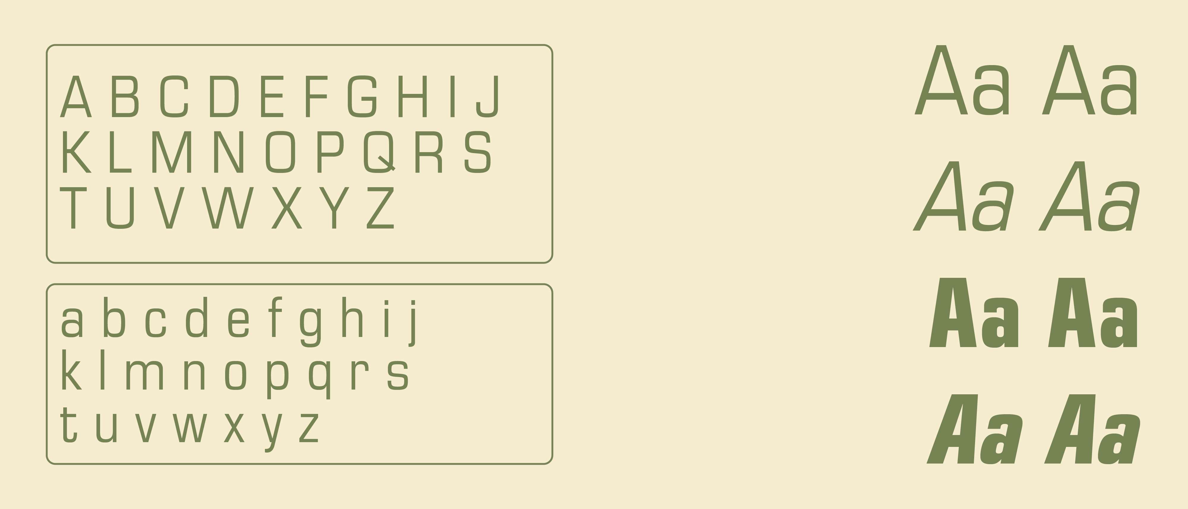
A typeface that bridges midcentury-modernism with futurism. From Italian origins to wide-spread media fame, its a beautiful cross of form and function.

Eurostile was designed in 1962 by Aldo Novarese for the popular Nebiolo type foundry in Italy. It was based on Novarese’s earlier work, the font Microgamma. Unlike its predecessor, which only featured capital characters, Eurostile includes uppercase and lowercase letters, a bold and condensed variant, as well as an extra narrow design he called Eurostile Compact. The original version featured seven different fonts. It marked a moment of importance in graphic design history when the modern aesthetic became desirable.

HISTORY

The A, W, M, N, and V glyphs feature a unique flat apex, and the lowercase t has a tail that curves 180 degrees. It carries features from the 1950s and 1960s while still maintaining a futuristic and spacey appeal. This is due to the Space Age of this time period, which was characterized by the Space Race, technological advancements, and other aesthetic trends popular in media, merchandise, and other areas. Primarily used as a display font, Eurostile is popular for various headings and signs. The uniformity of the glyphs make it suitable for technical and corporate branding material as well as media.

"IN USE"

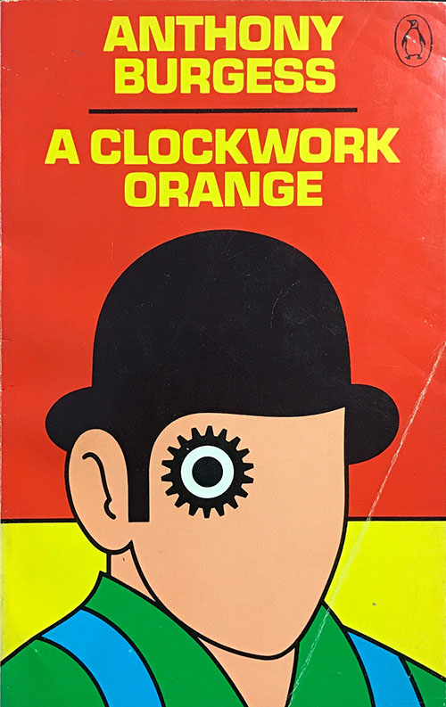
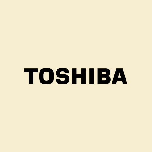
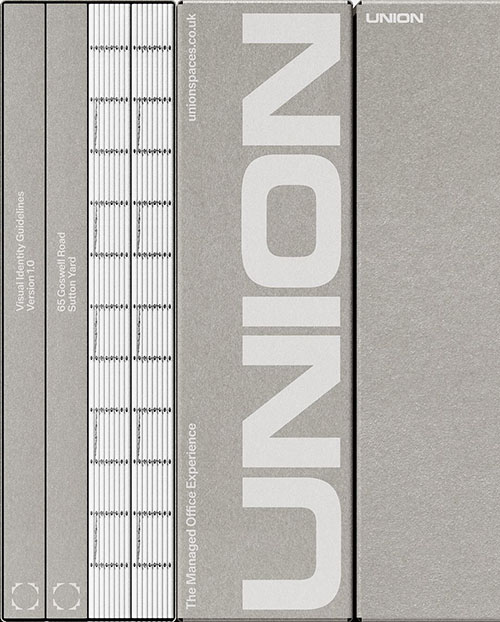
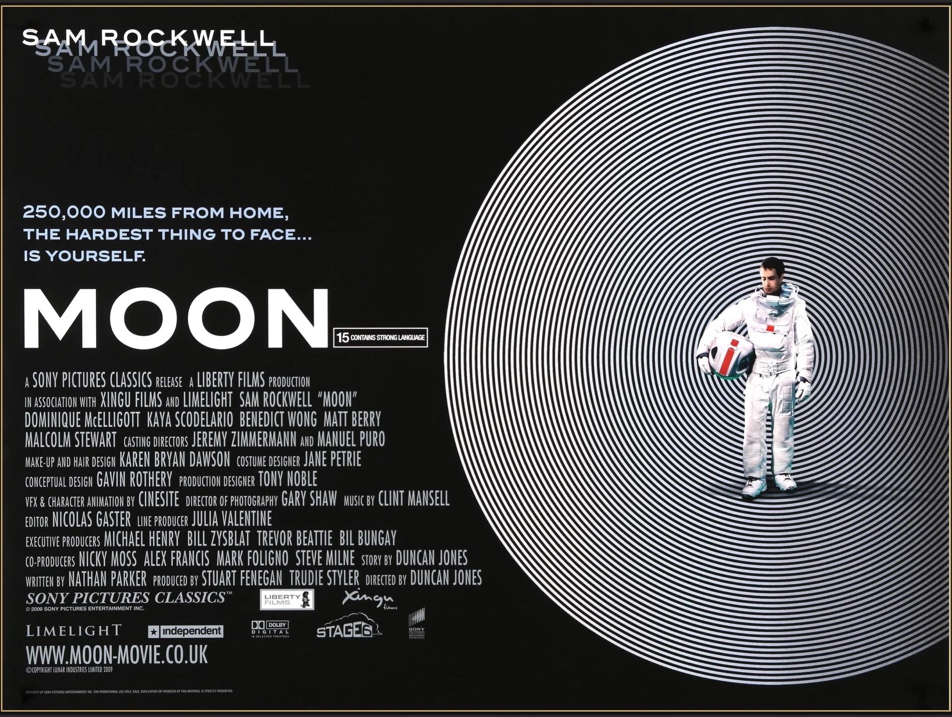
Primarily used as a display font, Eurostile is popular for headings and signage. The uniformity of the glyphs make it suitable for technical and corporate branding material as well as media. It is impressive how versatile this typeface has managed to be. This serves as an example of how much of an impact form and function have in regard to typography. It has been featured in numerous promotional and logo materials, including album covers, TV series, cars, video games, and even currency. Unsurprisingly, it was popular choice for science fiction media set in the 60’s and 70’s. Its versatile yet unique style makes for a timeless and chic typeface.

clockwork orange toshiba logo
60 minutes logo union